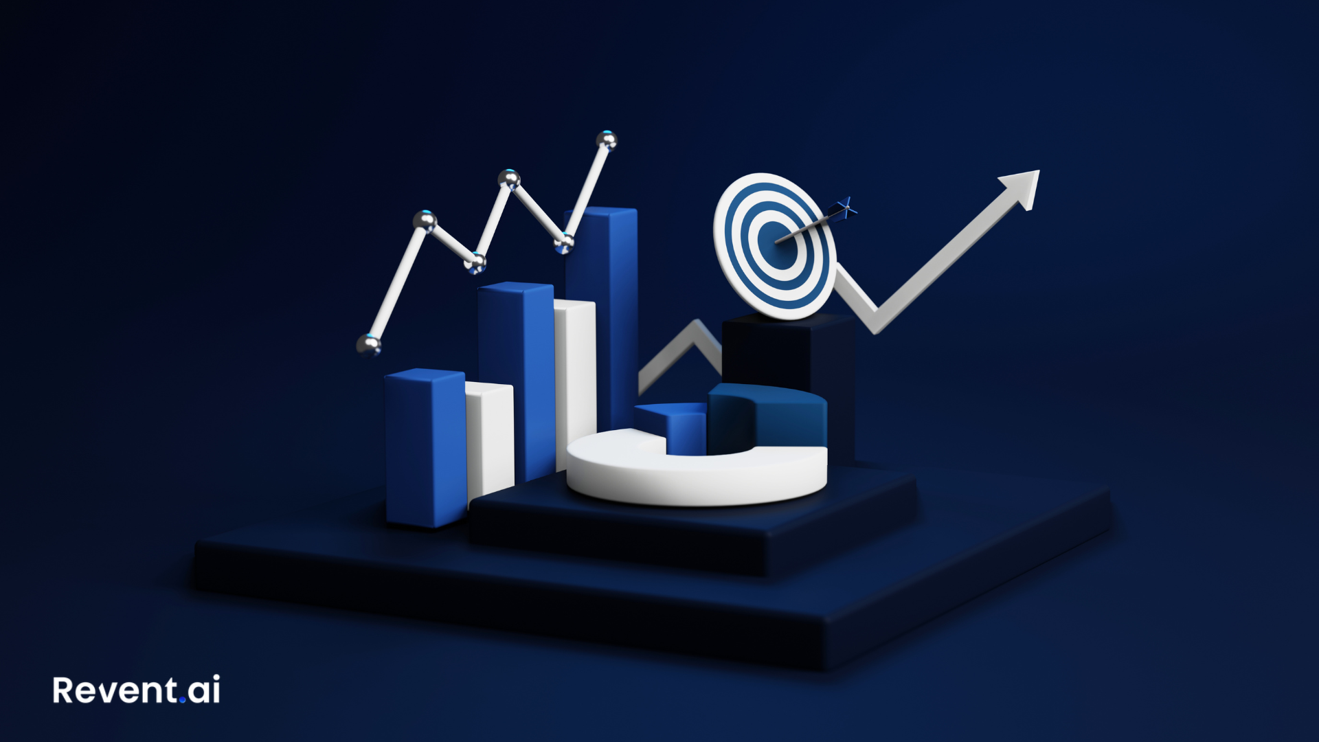
Transform Presentations with Data Visualization for Maximum Impact
Rashesh Majithia
|
29 Dec, 2024
Why Is Data Visualization Important in Presentations?
In our fast-moving, data-heavy world, presentations must do more than just show slides and text to capture attention. Enter data visualization, a powerful tool that transforms raw data into compelling visuals, helping audiences quickly grasp intricate information and make informed decisions. But why is data visualization so crucial in presentations? Let’s explore.
1. Simplifies Complex Information
Raw data, while valuable, can be overwhelming when presented in large tables or dense text. Data visualization turns numbers into easy-to-read visuals like charts and graphs.
- Example: A pie chart showing market share distribution is far easier to understand than a table filled with percentages.
- Fact: According to a study, the human brain processes visual information 60,000 times faster than text, making visuals essential for comprehension.
By visualizing data, presenters ensure that key points resonate with their audience.
2. Enhances Audience Engagement
People's attention spans are short these days, especially during presentations. Static slides filled with text can quickly lose an audience's interest. Data visualization, however, adds a dynamic element that captures attention and sustains engagement.
- Interactive Visuals: Tools like heat maps or motion charts keep viewers involved by allowing them to explore data in real-time.
- Illustrative Graphs: Line graphs showing trends or bar charts comparing categories offer a visually stimulating way to understand information.
Engaged audiences are more likely to retain information and participate in discussions, which is the ultimate goal of any presentation.
3. Strengthens Decision-Making
Presentations often aim to drive decisions—whether in boardrooms, classrooms, or conferences. Data visualization provides the clarity and context necessary for decision-making by:
- Highlighting trends and patterns.
- Offering insights that would otherwise be buried in raw data.
For example, a sales manager presenting quarterly performance can use a line graph to show revenue growth, helping the team decide on future strategies. Without visuals, the same information might take far longer to convey and could be misinterpreted.
4. Builds Credibility
A well-designed presentation not only delivers information but also establishes the presenter’s credibility. Data visualization helps achieve this by:
- Professionalism: Clean, accurate visuals reflect preparation and attention to detail.
- Transparency: Visuals make it easier to back up claims with evidence.
Studies show that presentations with visual aids are 43% more persuasive than those without. By using data visualization, you demonstrate expertise and build trust with your audience.
5. Makes Presentations Memorable
Retention is one of the biggest challenges presenters face. Audiences often forget key points shortly after a presentation. Data visualization combats this by making information more memorable.
- Fact: According to research by 3M, visuals improve learning and retention by up to 400%.
- Real-World Example: A TED Talk that uses compelling visuals to explain a scientific concept is more likely to be remembered than one relying solely on spoken words.
When your audience can recall your message, your presentation achieves its purpose.
6. Encourages Storytelling
Great presentations are built on great stories. Data visualization acts as a storytelling tool, helping presenters weave a narrative around their data. Instead of simply listing facts and figures, presenters can:
- Show a timeline to narrate progress over time.
- Use maps to highlight geographic patterns.
- Create layered visuals to show cause-and-effect relationships.
Storytelling with visuals transforms a mundane presentation into an impactful experience.
7. Adaptable Across Industries
Data visualization is not limited to a specific field or audience. Its versatility makes it applicable in various industries:
- Business: Visualize KPIs, sales performance, and market trends.
- Education: Simplify complex concepts for students with graphs and infographics.
- Healthcare: Present clinical trial results or patient data in an accessible format.
- Media: Use visuals to break down news stories for broader audiences.
No matter the industry, data visualization bridges the gap between raw data and actionable insights.
8. Reduces Misinterpretation
Misunderstood data can lead to poor decisions, miscommunication, or even reputational damage. Data visualization reduces this risk by:
- Presenting data in clear, unambiguous formats.
- Highlighting anomalies or outliers that require attention.
For instance, a scatter plot can easily show correlations (or lack thereof) between variables, avoiding assumptions based on incomplete information.
9. Elevates Team Collaboration
In collaborative settings, data visualization fosters better understanding and alignment among team members. Visuals serve as a shared reference point, ensuring that everyone is on the same page.
- Example: A project manager using a Gantt chart can clearly communicate project timelines and responsibilities, minimizing confusion.
By streamlining communication, data visualization helps teams work more effectively toward shared goals.
10. Leverages Technology for Maximum Impact
Modern tools make data visualization more accessible and dynamic than ever. Platforms like Tableau, Power BI, and Google Data Studio allow users to create customized visuals with ease. Advanced AI-driven tools like Revent AI take it a step further, automating the process and tailoring visuals to specific data and presentation styles.
With the right tools, you can focus on your story while technology handles the design.
Tips for Effective Data Visualization
- Know Your Audience: Tailor visuals to match the knowledge and interests of your audience.
- Keep It Simple: Avoid overloading visuals with unnecessary details or too many colors.
- Highlight Key Points: Use contrasting colors or annotations to draw attention to critical data.
- Use the Right Format: Choose the visualization type (e.g., bar chart, scatter plot) that best represents your data.
- Test Before Presenting: Ensure your visuals are accurate, legible, and error-free.
Conclusion
These days, data visualization isn't just nice to have; it's essential. From simplifying complex data to enhancing engagement and decision-making, its benefits are undeniable. By integrating compelling visuals into your presentations, you not only make your message more impactful but also leave a lasting impression on your audience.
Whether you’re presenting to stakeholders, teaching a class, or sharing research findings, data visualization is your key to success. Explore tools like Revent AI to simplify and elevate your presentations, turning raw data into visuals that truly speak to your audience.
Ready to Transform Your Presentations?
Create stunning AI-powered presentations in minutes
Related Blogs

Create Professional Presentations Fast with Revent AI Tool
Transform data into professional presentations in seconds with Revent AI's intelligent design and seamless branding integration.

Effortless and Professional Presentations-Quickly
Stunning presentations creation in a quick,smart and accurate way. Try Revent Today. Save Time Boost Productivity.
Transform Presentations with Storytelling Using Revent AI
Learn how storytelling transforms presentations into unforgettable experiences. Discover key tips and tools to captivate your audience effortlessly.